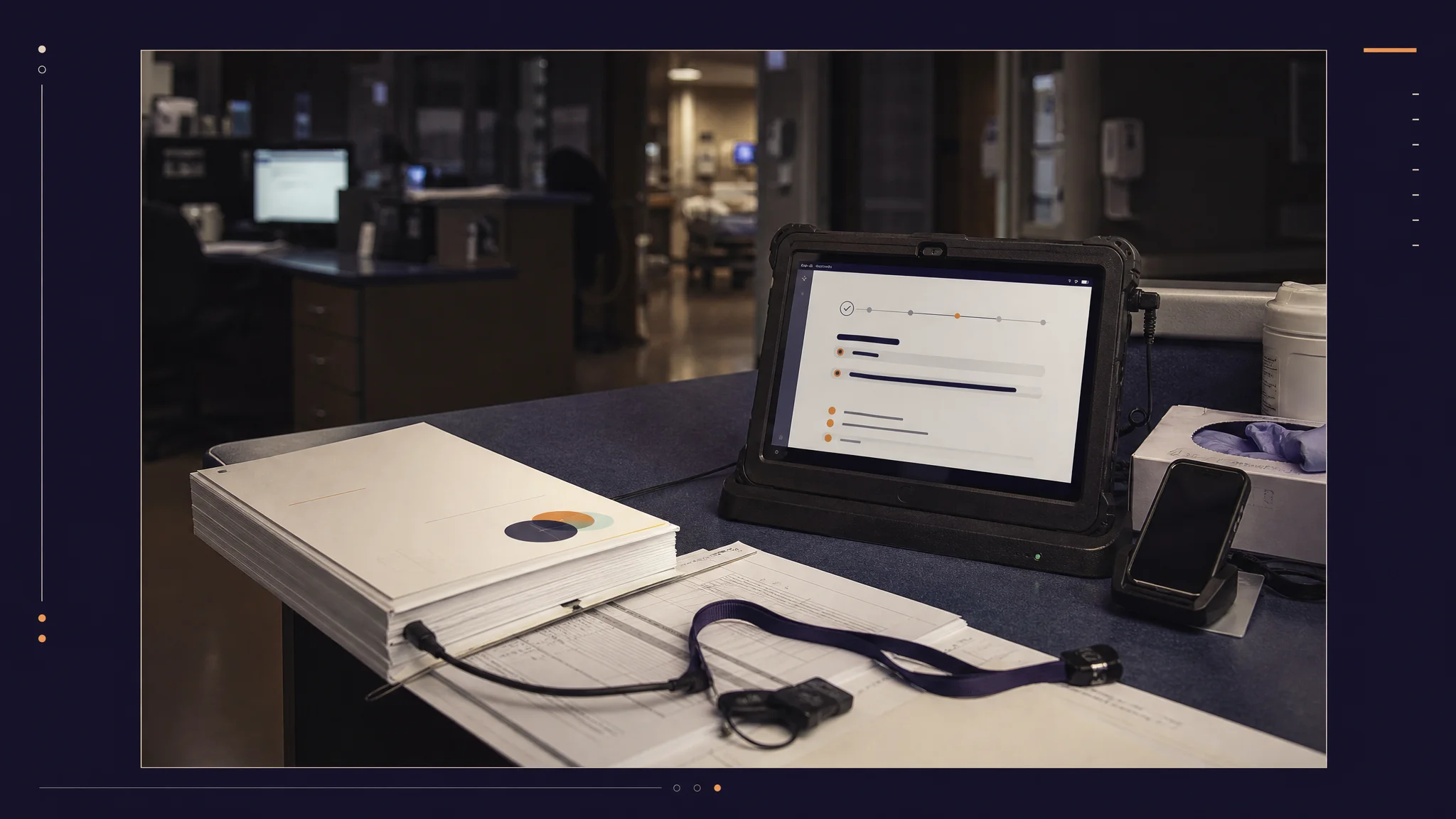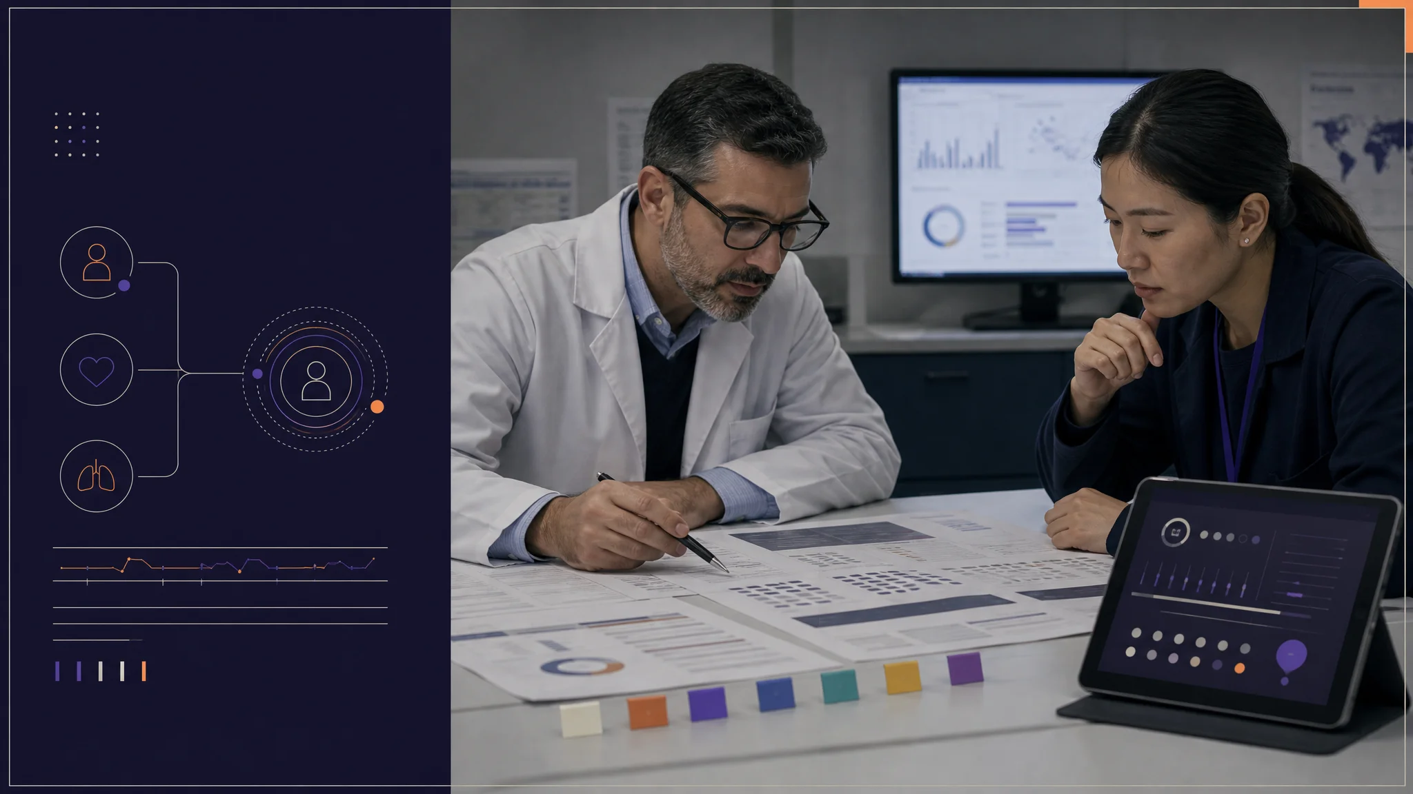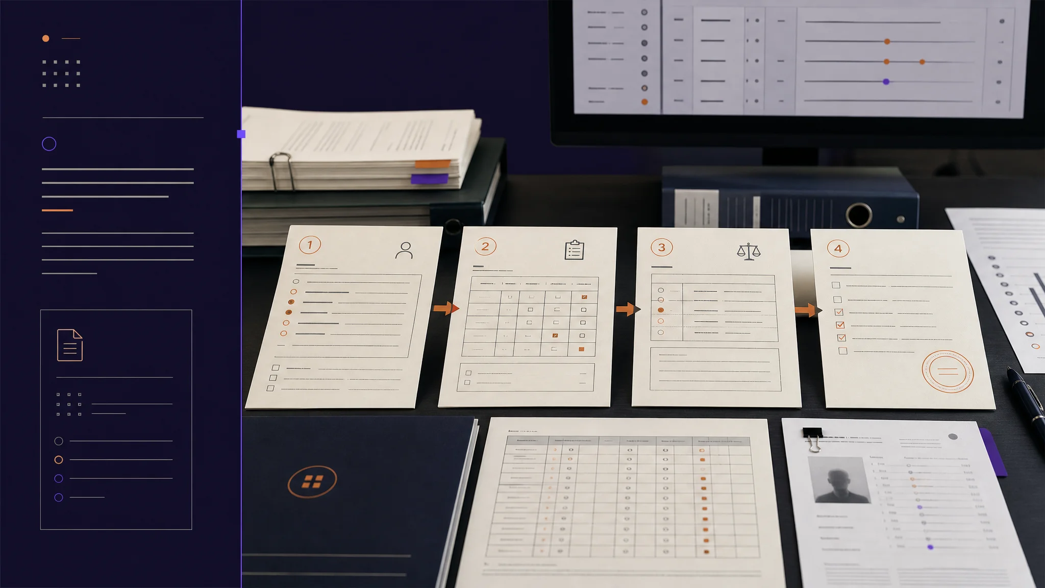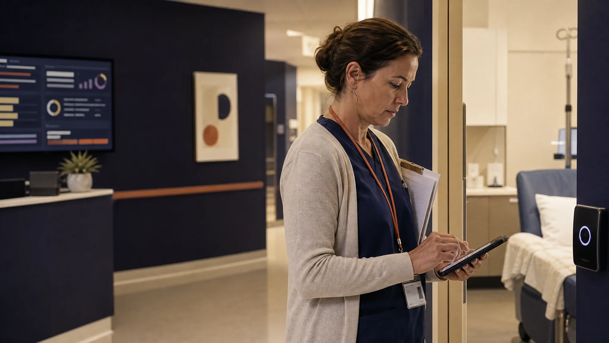
Clinical trial coordinators do not spend their entire day at a workstation. This week's release brings the grading workflow to wherever the patient encounter happens, and rebuilds authentication to survive the realities of clinical interruption.
A week about meeting clinicians where they actually work
Clinical trial coordinators do not spend their entire day at a workstation. Between patient visits, ward rounds, and quick consultations, the work is mobile. Yet most clinical documentation tools quietly assume the user is sitting at a desk. The cost is real: documentation gets deferred to the end of the day, memory degrades, and the longitudinal record loses fidelity.
This week we closed three pieces of that gap. CTCAE grading now works fully on the mobile provider app. A new recent-cases dashboard surfaces what needs attention. And authentication state now survives the realities of being interrupted mid-flow.
Here is what shipped, why it matters, and what is next.
Feature Highlight 1: CTCAE grading on the mobile provider app
The mobile grading flow now mirrors the web. Touch-optimized term search returns matches with fuzzy matching (type "fat" and "Fatigue" appears in the result set). Each term opens to the full five-grade definition before the coordinator commits to a grade. Manual grade entry captures the rationale text the audit trail requires. Submissions sync to the web dashboard in real time.
The intent here is not feature parity for its own sake. It is closing the gap between observation and documentation. In Phase 1 trials, where memory of a transient adverse event fades over minutes, not hours, the difference between grading at the bedside and grading from a desk at end-of-day is the difference between a defensible record and a reconstructed one.
Feature Highlight 2: Recent Cases dashboard
Finding the case a coordinator was just working on should not require scrolling through a queue. The new Recent Cases card surfaces three counters that map to how coordinators triage: total adverse events across recent visits, Grade 3-and-above events that need immediate attention, and cases awaiting review. A single tap routes into any case. The card pulls real-time state from the backend, so it reflects the actual queue, not a stale snapshot.
This is the kind of small surface that, on its own, looks unimportant. It removes the ten-second-per-context-switch tax that compounds across a forty-patient day.
Feature Highlight 3: Authentication that survives interruption
We rebuilt the mobile authentication flow with one constraint in mind: the clinician will get interrupted. Email persists across attempts, so signing back in does not start from scratch. The OTP step persists too, so a verification code received and then dropped into a different app does not require restarting the flow. Protected screens show a non-intrusive bottom-sheet sign-in instead of a full-page redirect. Authentication state survives app backgrounding and device restart.
The technical posture: a persisted state layer between auth and the rest of the app, so being kicked out of the screen never means being kicked out of the workflow.
Improvements and bug fixes
- Header now carries the brand identity rather than a generic icon
- Primary navigation labeled "Search" instead of the ambiguous "Home"
- Dark mode color palette tightened from blue-tinted to neutral grayscale
- Settings screen adapts dynamically to authentication state
- Removed approximately 1,300 lines of unused mobile code (a dead visit-detail page and a dummy data file), centralized type definitions, and introduced a cleaner workflow-resource architecture so the next month's mobile features compose against a smaller, more honest substrate
- Fixed: Gender field accidentally including "Unknown" as a selectable option (removed)
- Fixed: Smart-quote characters causing text-encoding regressions in the onboarding screen
- Fixed: Settings input styling drifting from the rest of the app
- Fixed: Media selection modal feeling cramped on smaller phones
Looking Ahead
Next: offline-capable grading for low-connectivity environments, push notifications for cases pending review, and a tablet-optimized layout for iPad users at the bedside.
More Friday updates at burna.ai/blog.